Building a new version of a classic performance car like the Honda NSX and Toyota Supra is never an easy thing.
Whereas the Mk4-generation Supra and original NSX shook up the performance car market when they were launched, their successors haven’t really done the same. Debate has also raged for quite some time about the designs of the new cars, in particular the Honda that has split opinions.
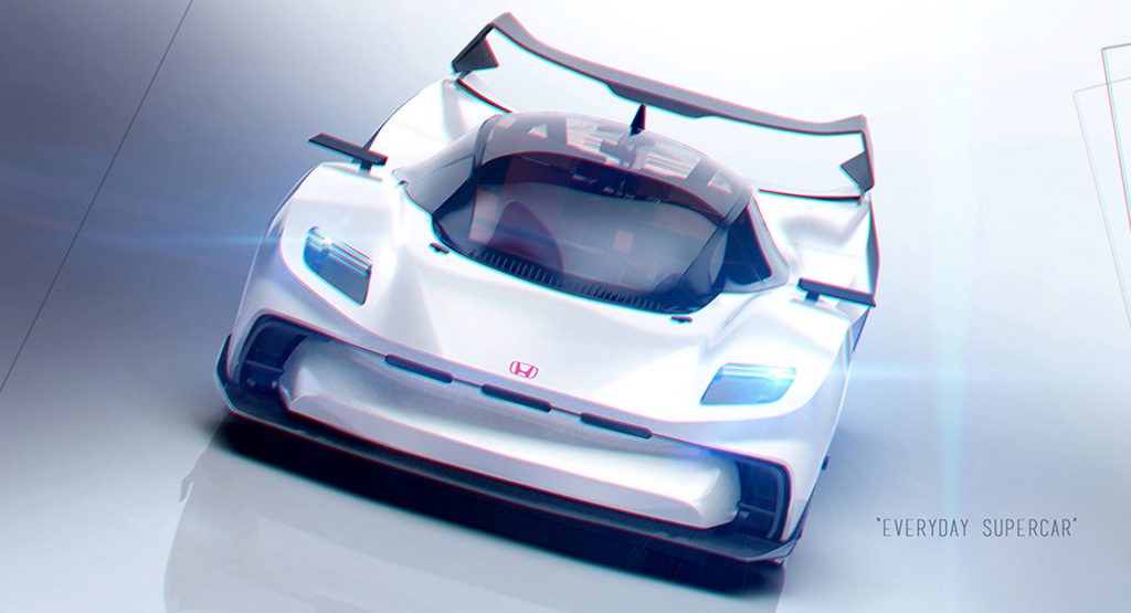
Many complained that the new NSX looked too much like other mid-engined supercars on the market such as the Audi R8. Although we can see a point there, we happen to like its styling, but this project from designer Matteo Mariuzzo imagines what the new NSX could have looked like if the Japanese carmaker had adopted more cues from the original instead of opting for something totally new.
Also Read: Acura/Honda NSX Type R On Track For 2019 Tokyo Motor Show Premiere?
The overall shape of the concept has a number of obvious similarities to the first NSX and looks nothing like the current car. For example, the cockpit is placed very far forward and the vehicle features an exceptionally long rear decklid. Speaking of the rear, it supports taillights similar in design to the original but updated with LEDs and slightly tweaked to be more fitting of a modern car.
Mariuzzo’s concept also showcases a front end with simple headlights and no obvious grille (no need, after all, as the engine’s in the back). Instead, there are three small cut-outs in the center of the front fascia and two air intakes on either side.
Overall, this is an interesting take, but maybe the people over at Tochigi made the right choice by starting from a white piece of paper – or computer screen, if you like. Or did they – after all, the first NSX was so innovative, it still looks appealing even after all these years.


