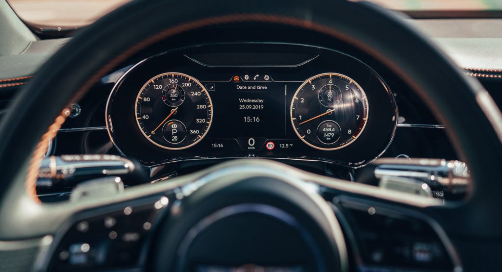
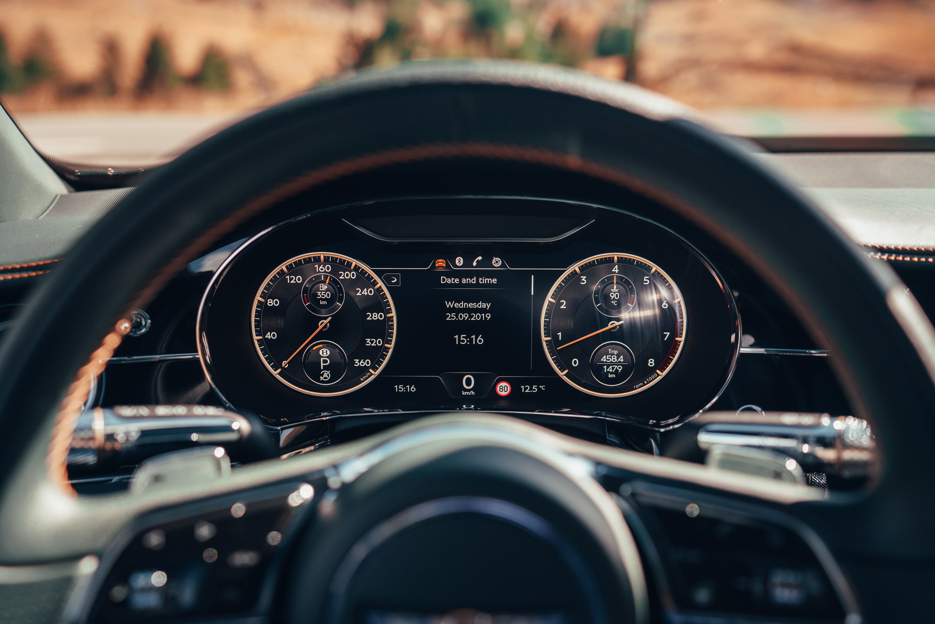
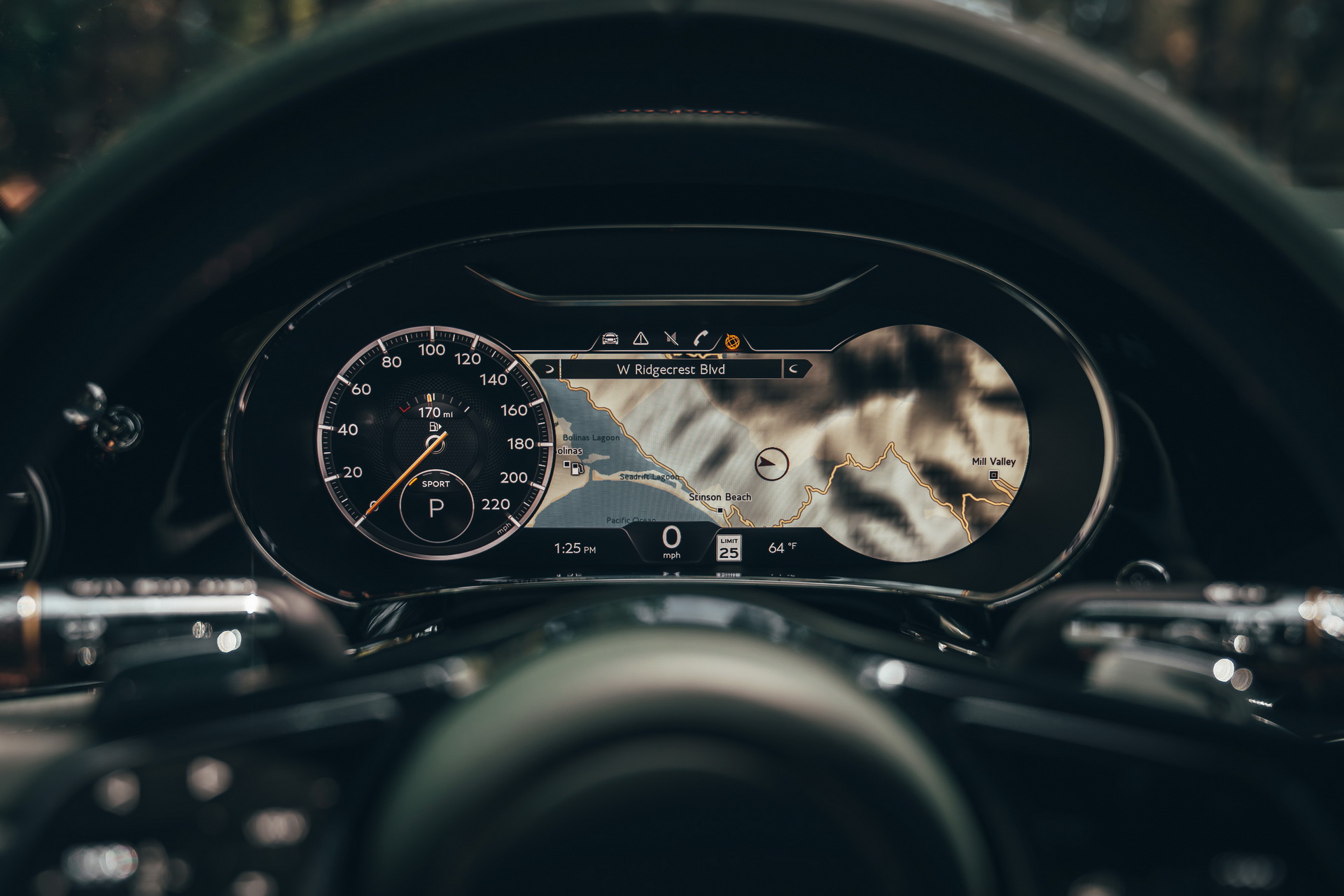
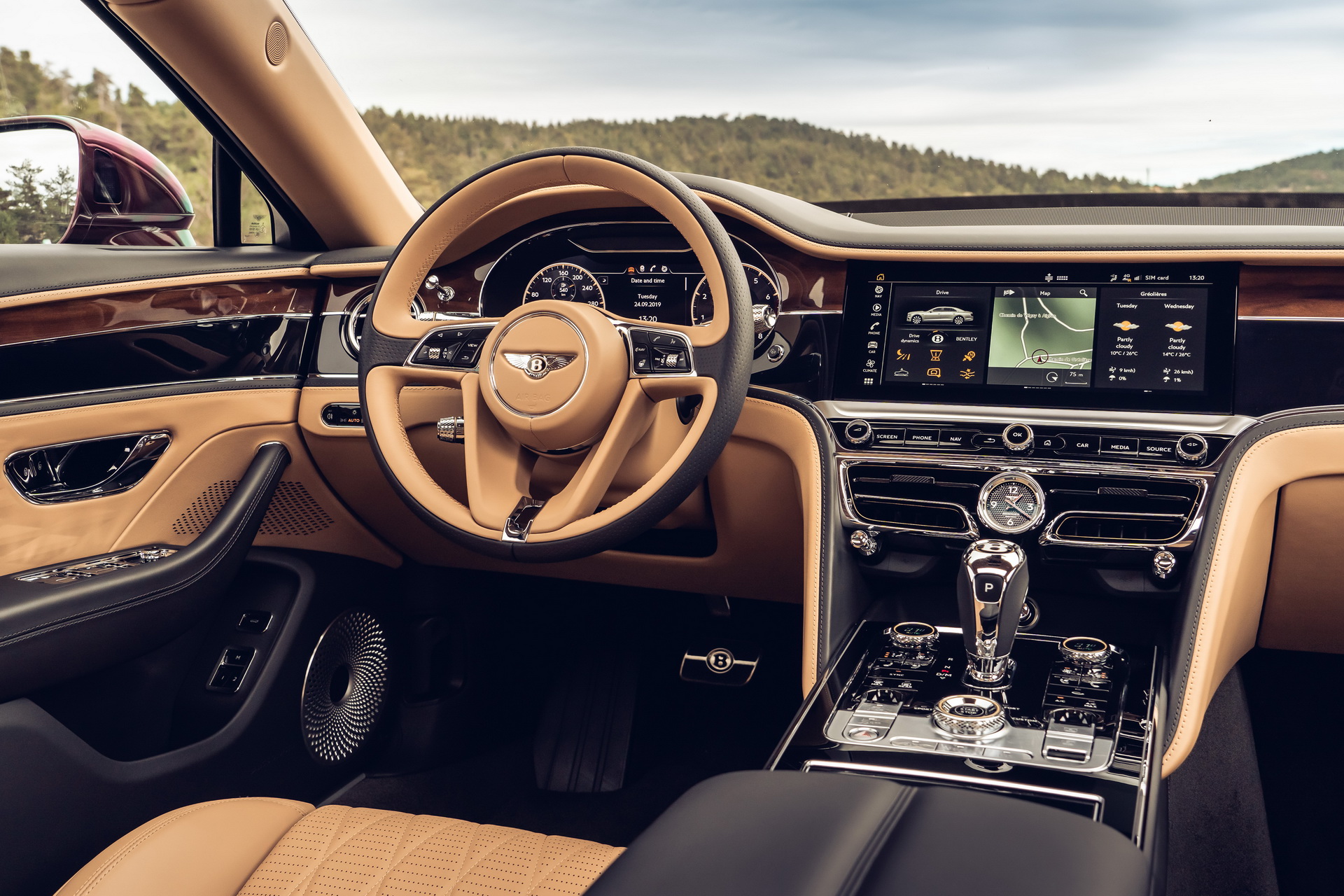
For Bentley, giving a flat-screen display the same design ethos as you get with the handcrafted wood and crisply knurled metals that surround them was quite the challenge.
It took Graeme Smith and his Human Machine Interface (HMI) design team a lot of work to figure out how to build gauge displays and infotainment screens that would age as well as the overall design of the interior.
The key decision came when they had to either go with a flat digital design or a skeuomorphic one (a 3D graphic representation of a physical object).
Read Also: Check Out The Bentley Flying Spur’s Detachable Touch Screen Remote
“A Bentley isn’t a smartphone; it’s going to be used and cherished for generations. So we chose a skeuomorphic approach that will age with the car. Look at pure digital instrument graphics from ten years ago – they’ve dated faster than the car they were part of,” said Smith.
“In general, skeuomorphism is being phased out in favour of a clear and flat graphic communication of information. But we were quite clear about not going all the way to this kind of ultra-modern digital graphic. It would have been wrong for the brand and for the car. We still use skeuomorphism, dials and needles, to convey the traditional way of getting this kind of information,” added design director Stefan Sielaff.
Now, while both the Continental GT and the Flying Spur feature the same driver instrumentation, there are subtle design differences between the two. For example, the Flying Spur comes with a bronze chapter ring around both the speed-o-meter and the rev counter.
Meanwhile, the Conti GT’s dials feature a 3D-effect to the background knurling, whereas the Flying Spur’s dial has an outer “machined” disc where the numerals sit.
Night Mode
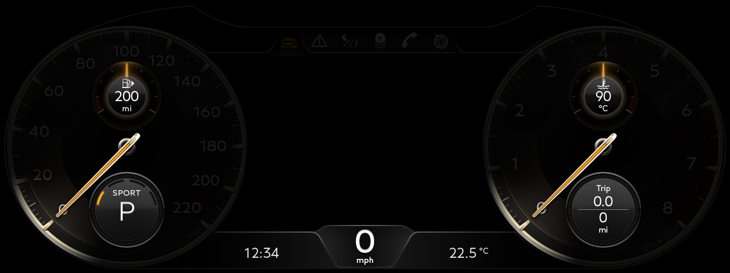
The system’s dim screen mode function is meant to offer a sort of “digital detox” moment for the driver, according to the British carmaker. You only get to see a bare minimum of information (fuel, engine temp, time, speed and outdoor temp). Even the speedo and rev counter dials go dark, except for a “soft pool of light” around the point of each needle.
Language is a lot of work
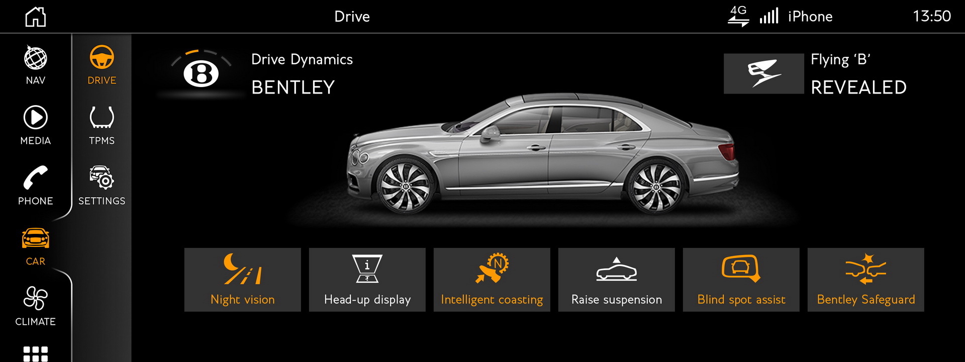
Once you finally get the design to where you want it, you then need to translate everything from every menu, operation and screen. For the central display in the Flying Spur, this meant designing roughly 600 different icons and over 1,500 menu screens.
“There were the different alphabets and page orientations of English, Russian, Arabic and Chinese to incorporate, and text for 27 different languages to translate and accommodate within the screen layouts. Graphics that relate to proprietary systems or icons, like Sirius radio in the US or Apple CarPlay, have to be signed off by those companies. There are three different audio systems – Bentley, Bang & Olufsen and Naim – all with their own graphic interface. It’s a logistical labyrinth that demands patient, logical, problem-solving minds. The Human Machine Interface team at Bentley includes three graphic designers and nine ‘function owners’ who each take responsibility for a specific infotainment area, from audio to climate.”
The 2020 Bentley Flying Spur is priced from $214,600 in the United States.


