A lot of carmakers have decided to update their logos in order to stand out in this new digital and electrified age of the automobile, with Volkswagen being just one recent example.
Opel is yet another German company that’s looking to streamline its branding, unveiling a new logo that features a brighter yellow color and a new typeface. The color is called Neon Opel Yellow while the font was dubbed Opel Next.
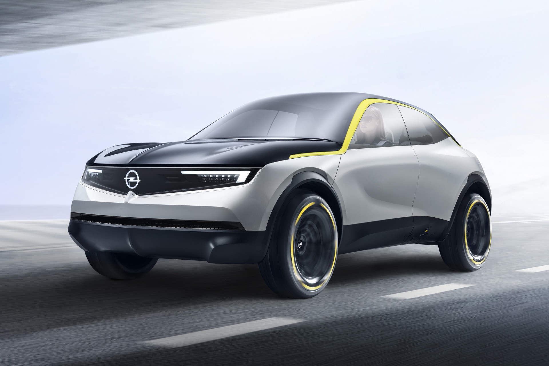
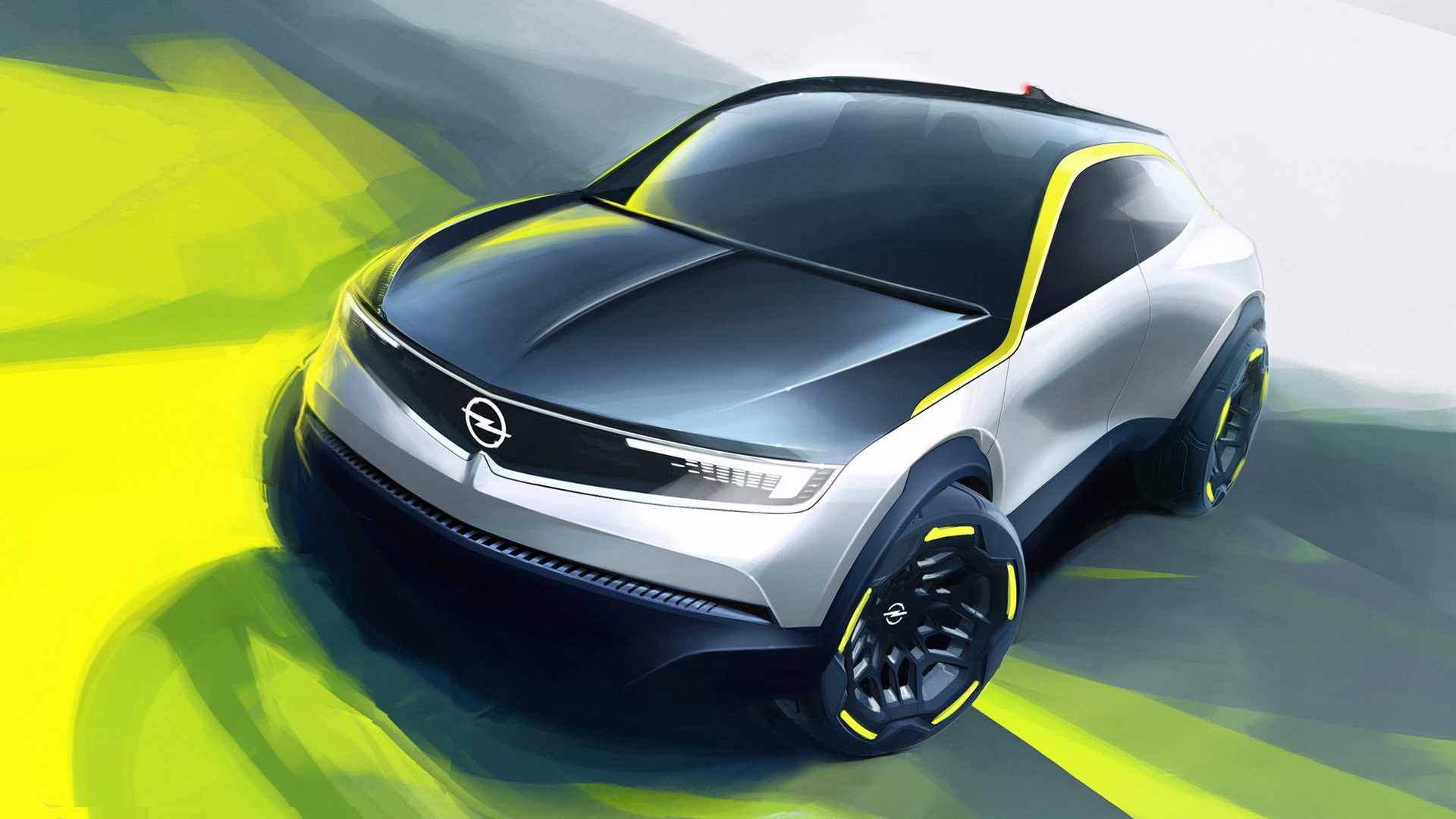
Starting in the first half of next year, customers and onlookers in Europe will be able to experience all these new elements courtesy of the new Opel Crossland and the all-new Mokka. These will be the very first production cars to feature the redesign.
Related: Turns Out The 2021 Mokka Debuted Opel’s Redesigned ‘Blitz’ Logo
“We are confident, young-minded and inclusive. In this new era Opel is taking inspiration from progressive, ‘cold to cool’ Modern German culture and re-emerges bold, pure and contemporary. This is the expression of our new brand identity and absolutely represents our exciting new product line-up,” stated Opel marketing exec, Xavier Duchemin.
The circle is slimmer than before, while the typeface is more modern and clear. Meanwhile, the new Opel Yellow color is meant to symbolize electricity – which makes sense given the fact that electric power is taking over the car industry.
“A new era needs modern brands and modern brands need a clear design. WIth the new brand elements, we are expressing our claim to be distinctive, progressive, open to the new and open to the future,” explains global marketing boss for Opel/Vauxhall, Patrick Fourniol.


