Audi’s four ring logo dates back to the early days of Auto Union and it has been updated countless times over the decades.
The latest evolution of the badge largely flew under the radar as it debuted on the facelifted and renamed Q8 e-tron. However, Audi is circling back and highlighting its new take on the classic logo.
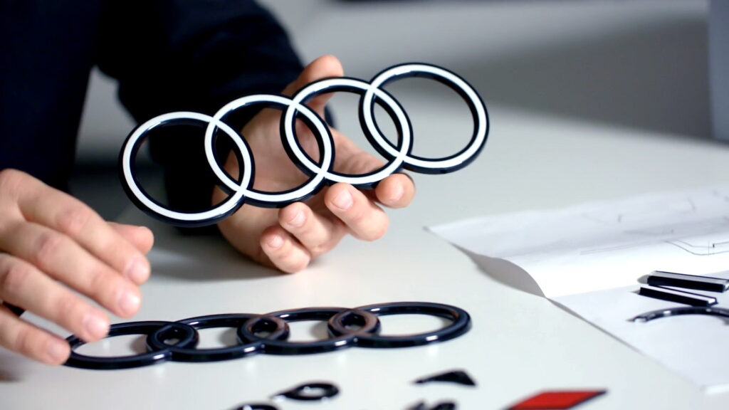
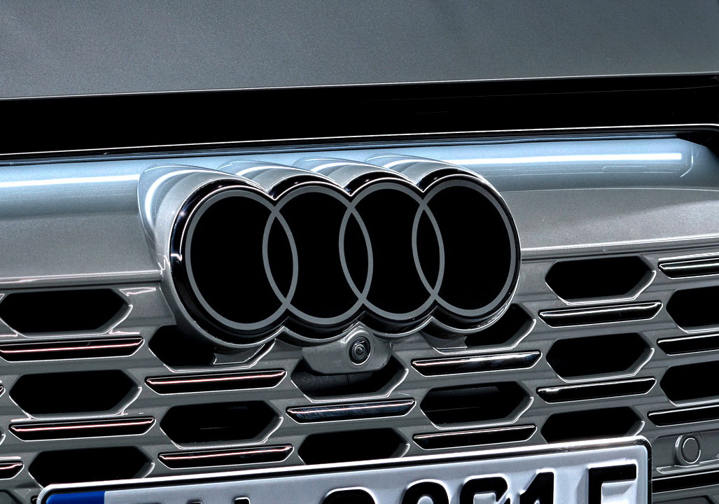
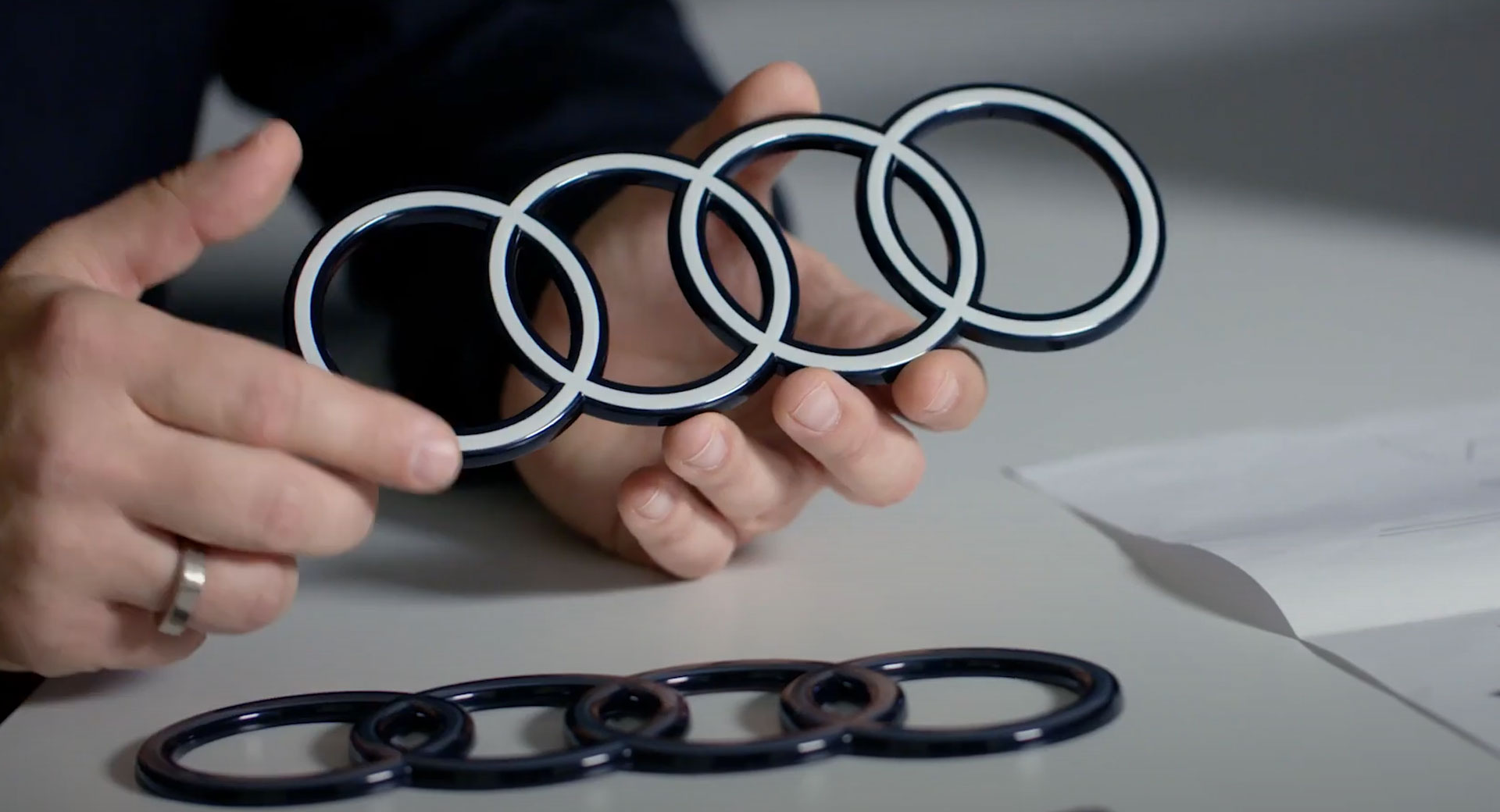
Designed to give vehicles a “more modern image,” the new logo has a black background that contrasts with white rings for an “even greater radiance.” The two-tone appearance also promises to make the logo highly visible, even from a distance.
Also: BMW Introduces New Flat Logo For Use On Promotional Materials, Not On Cars
While there will be variations of the logo, including a more subtle black and grey design, all versions will have a two-dimensional appearance. As strategist Frederik Kalisch explained, the “two-dimensional rings originated at Audi in 2016 as a consequence of digitalization, essentially to depict the rings in a manner that suited the medium.” However, the company wanted to have a “consistent brand presence across all customer touchpoints,” so they embarked on the process of redesigning the rings for their vehicles.
His sentiments were echoed by designer André Georgi, who said “We want the four rings to look the same everywhere in the future: Whether in a magazine, on your smartphone, or a billboard – and on or inside the car.” He added, “The new two-dimensional look gives our rings a significantly more modern and even more graphic makeover, although their geometry is almost identical to the former ones.”
Interestingly, Audi is keeping the new logo “consistently free of chrome.” That’s a notable departure as chrome logos used to be a hallmark of Audi.
Besides the new logo, future models will use an exclusive font known as Audi Type. As Georgi explained, “The basic tone is significantly more restrained without compromising on distinctiveness or quality.”


