Lamborghini can’t afford to give us all a car but it did recently give each and every one of us one of the cringiest ads ever seen. That got us thinking. What’s the absolute worst car promo video ever made?
This should be a pretty tough QOTD since there are a vast number of ads out there and we’d bet that most are less than great. Some of that has to do with the fact that many cars built today are boring and some of it has to do with poor marketing. Which ones are hideously bad though?
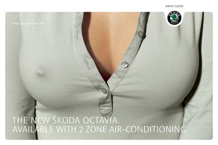
A few important caveats about this question of the day. Firstly, any video length is fine so long as it’s not an entire presentation. For example, the original Cybertruck reveal doesn’t count despite being pretty cringe. It does have to be a video, not a print ad. So no, ads like the one below, no matter how risque, don’t count unless they’re video.
More: Transformers Trailer Shows Porsche 911, Camaro Bumblebee And Gorilla Robot
A few examples come to mind. One good example is the 1991 Dodge Colt commercial featured in Canada where the vehicle causes damage in Quebec to a Celine Dion song. Another might be any of the ads that Volkswagen ran as part of its “Unpimp your auto” campaign that really just admitted how not-with-the-times (and slow) its products were.
If it’s up to me though I’m picking the very obscure promo for the Daewoo Bucrane, a concept car that I presume only two of you have ever heard of. The Bucrane was designed by none other than Italdesign back in 1995. While it might not be the very worst in terms of videography it’s for sure the weirdest car promo ever.
Take one quick look at the dual-action door situation and you’ll see what we mean. Not only does the Bucrane sport a ‘gull-wing’ style upper half of its door but it also has normal frameless lower portions of the door. So to get in or out you have to wait for the upper half to get out of the way before you move.
Do you remember anything else designed by Italdesign back in 1995? If you answered the Lamborghini Cala concept you’d be right and it just so happens that both cars appear in the promo below. We’re counting it as the worst because of all the horrible transitions and graphics but also because it used a totally different (and clearly superior car) to make the main star look good.
What do you think is the worst car promo ever? Let us know in the comments below!


