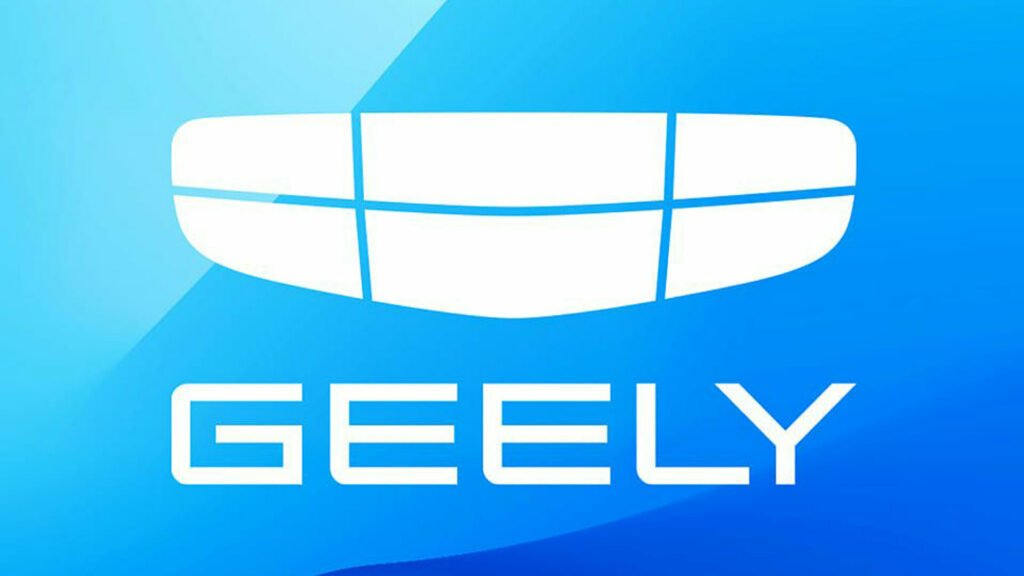
Geely is hopping aboard the new logo train as they’ve unveiled an updated insignia, which “signifies our all-new brand aspiration to be more open and unlimited in the future.”
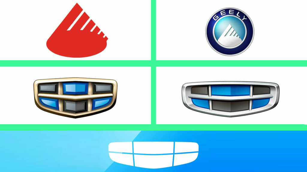
An evolution of the previous two incarnations of the logo, the latest version eschews the three-dimensional aesthetic for a flatter and more simplistic look. As you can see, it features a white ‘grille’ with slender horizontal and vertical lines.
Also: Audi Debuts New Black And White Logo With A Two-Dimensional Appearance

Geely Logo Evolution / CarScoops
It’s the most basic logo since the original silhouette of a red mountain, but it clearly references the “Innovative Geely 4.0” logo that was being used up until recently. The similarities are immediately apparent as both feature a wide ‘grille’ with six panels as well as a horizontal bar and two vertical lines. This design dates back to 2013, when Geely introduced their “Refined Cars 3.0 Era” logo. Both featured black and blue segments, which represented the “earth and sky, showing the brand’s hope of seeing its products traveling around the world and its ambition to reach for the skies.”
Geely didn’t say much about the new logo, but stated it is their “first step to pursuing smarter and more technological products for our customers.” The company added, “Our new chapter starts here! Let’s expect how it will shine and light up the future!”
While the new insignia looks a little plain, a number of companies have unveiled updated logos in recent years. The most recent was Audi, which introduced a black and white logo with a two-dimensional appearance last November. Two years prior, BMW introduced a flatter and more simplistic logo for communications and marketing material.


