The automotive industry has undergone something of a renaissance in terms of logo design, with a number of notable brands updating the crest that forms the center of their visual identity. But which did best, if any?
Over the course of the last five years, it seems that a remarkable number of automakers have decided to revamp their logos. Maybe their designers were bored during the pandemic, but the list of brands with new logos is quite long.
From Porsche to VW, from GM to Buick, Citroen, Renault, and even the relatively young Geely, all have opted to redesign their logo. While some made changes so small that you might not even notice, others simplified their logos, flattened them, and made them straighter.
Read: How A Sketching Accident Led To Buick’s Bold New Logo Design

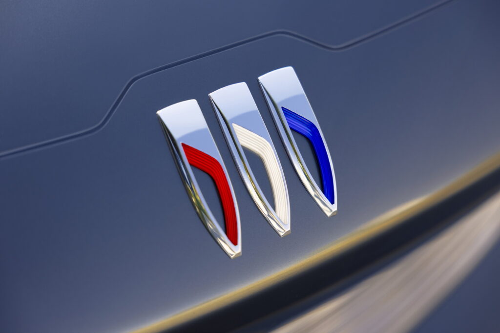
It all appears to be part of a move towards minimalism and away from ornament. Perhaps the clearest example of this trend is Buick, which cut the circle from its tri-shield badge and straightened them out to make its logo take up less real estate on its vehicles’ front ends.
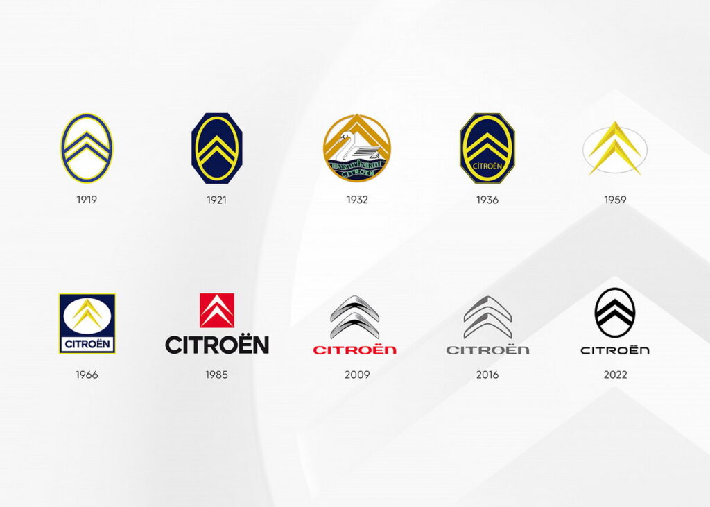
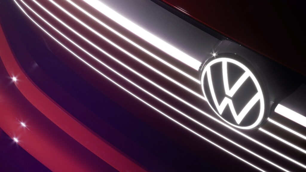
Even the brands that made relatively minor changes did so with a view to simplification. For example, Volkswagen and Citroën both flattened out their logos removing shadows to make them look less three-dimensional and, perhaps, more app-appropriate.
Indeed, I think the move can be interpreted as a response to automakers’ increasing focus on digitalization. All of the updates seem to be made in order for their logos to read better on a touchscreen, and to represent the shift to more simply designed electric vehicles.
And while that’s all fair enough, since that’s the direction that the automotive world is moving in, the worlds of interior design and fashion appear to moving away from minimalism and towards maximalism.
So what do you think? Is there a new minimalist brand logo that looks simply stunning? Is there a brand with an older, more ornate logo that appeals to you more? What’s the best in use today? Let us know in the comments below.


