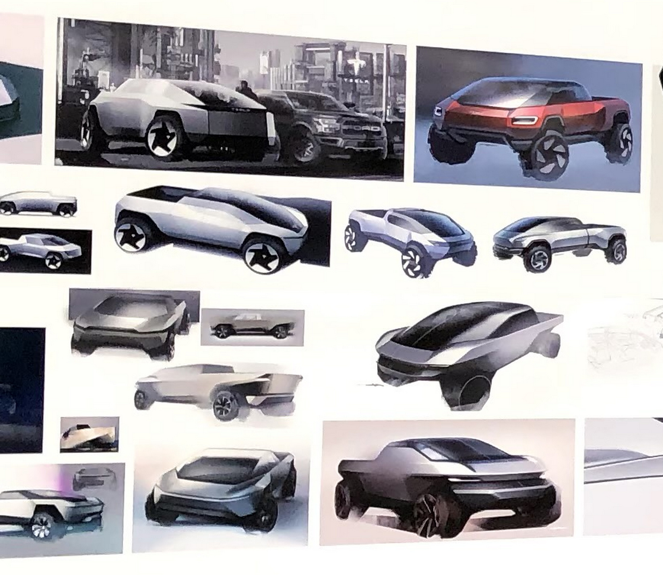
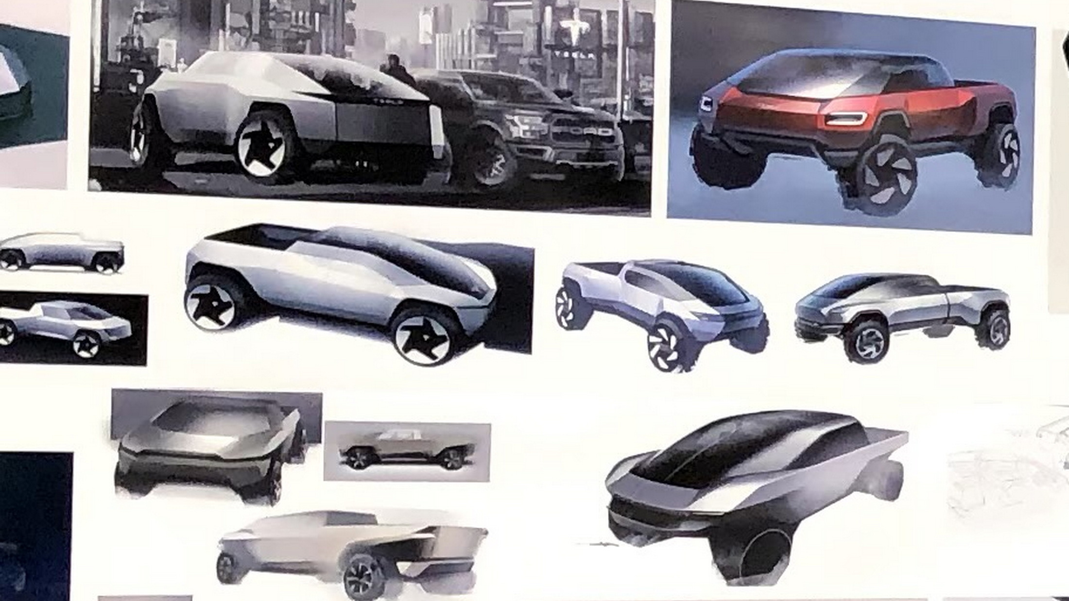
Elon Musk’s biographer, Walter Isaacson, has shared some passages from his upcoming book on the Tesla CEO ahead of its release. With them, he has published a behind-the-scenes photo of some of the Cybertruck designs the automaker was looking at before it landed on the one we now recognize.
The photo shows some of the inspirations that the design team was looking at, along with a range of design drawings that appear to be earlier iterations of the Cybertruck. While some details on the drawings are familiar, none is quite as angular as the one that Tesla eventually committed to.
“The Chevy Silverado was still on the showroom floor for reference,” Isaacson writes. “In front of it were three large display boards with pictures of a wide variety of vehicles, including ones from video games and sci-fi movies. They ranged from retro to futuristic, sleek to jagged, curvaceous to jarring.”
Read: Tesla Designer Explains How Cybertruck’s Design Was Impacted By Stainless Steel Body
Walter Isaacson / Twitter
The presence of the competing truck isn’t just set dressing, either. In another passage, shared to Twitter, Isaacson focuses on an earlier meeting in which Musk expressed his boredom with existing trucks, like the Ford F-150 and the Silverado.
From early on, then, Musk and Tesla chief designer Franz von Holzhausen were focused on being “edgy.” For inspiration, they looked to the worlds of video games and movies. That’s hardly a surprise, since the DeLorean’s impact on the Cybertruck is clear to see.
However, these design drawings show some of the other inspirations that Isaacson points to. For instance, design cues from the Warthog from the Halo series of video games can be seen in some of these drawings. Another drawing appears to be set in the Cyberpunk 2077 universe, where a Tesla logo can be seen behind it and a Ford F-150—perhaps in an attempt to appease Musk, who told his staff, “Like, don’t resist me,” upon receiving pushback on his ideas.
However, as Isaacson points out, and as von Holzhausen has indicated before, the decision to use stainless steel was one of the central limitations that led to the design. Because the material is so thick, and not particularly malleable, it must be bent into sharp angles, which explains the angular design we’ve come to recognize.
Do you think any of these designs are better than the one Tesla went with? Let us know in the comments.


