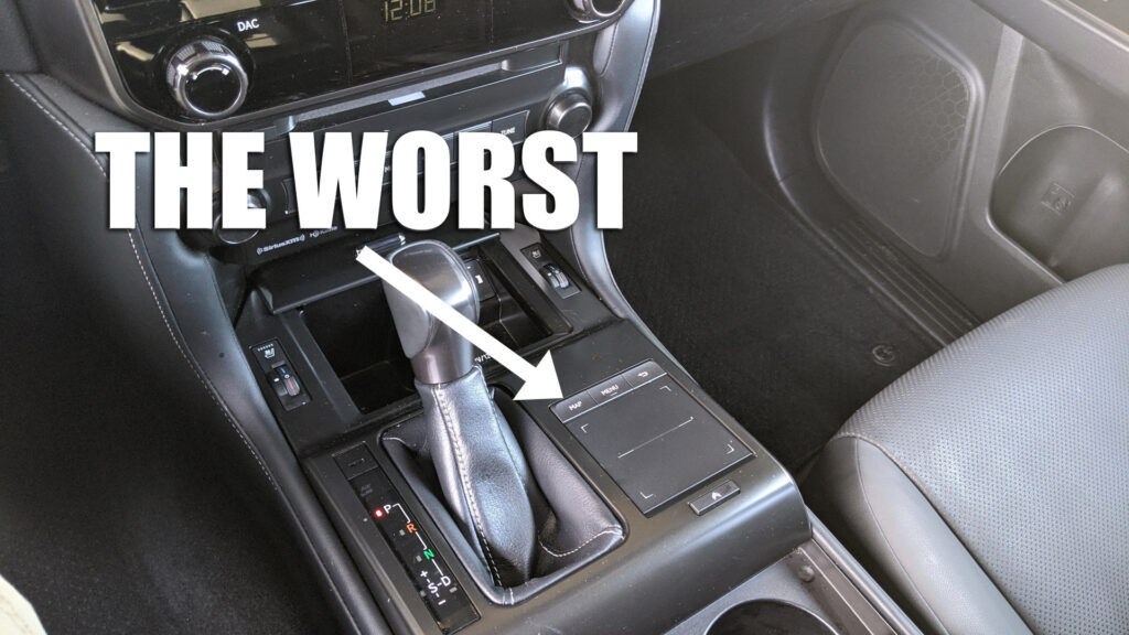
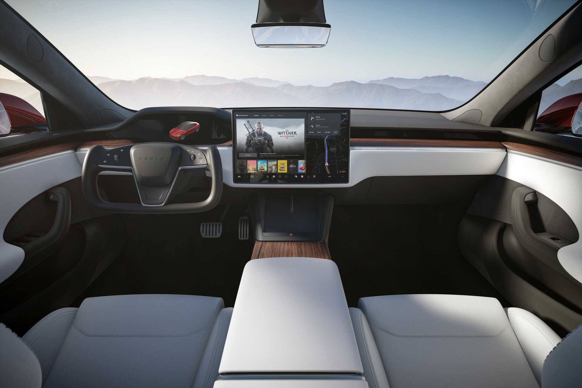
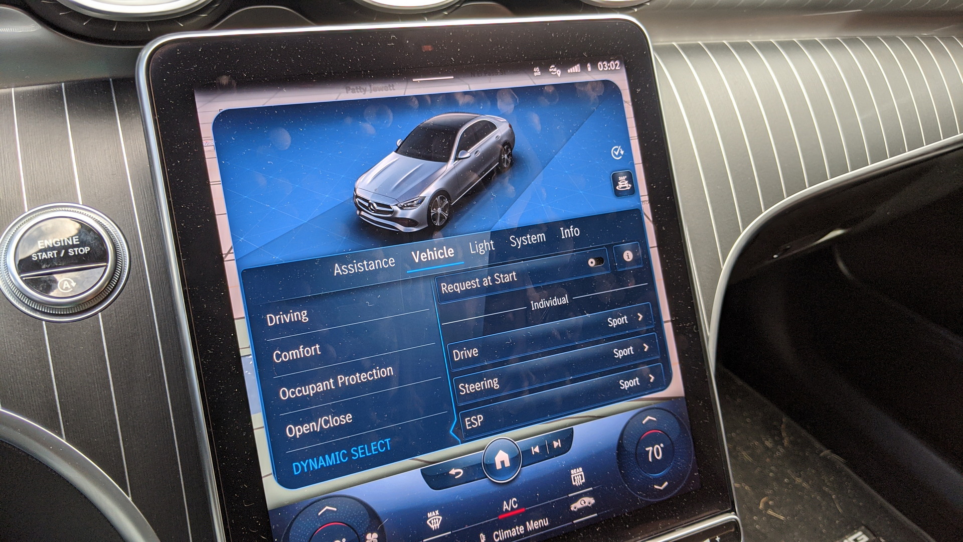
Infotainment systems have a knack for polarizing opinions in a manner that few other technological features do. It’s fascinating how each automaker puts its unique spin on how customers interact with their vehicles. In a recent QOTD, we delved into the question of which infotainment system reigns as the worst in the business, and the response was overwhelming.
Over 100 of you passionately shared your thoughts on the matter. Now, let’s dive into a comprehensive breakdown of the infotainment systems deemed the most lacking, according to your collective feedback.
5 – Aston Martin / Subaru

Each of these brands received four upvotes and no downvotes but for very different reasons. The Aston loses because the DBX has an “11 year old Merc non-touch screen.” No question, that’s pretty wretched for a vehicle that costs half of what a DBX does. Subaru as an entire brand gets special mention due to its lack of buttons and speed. Its’ 2024, any touchscreen that can’t keep up with an iPad from 2020 needs to go.
4 – Volvo

Speed continues to be a problem for Volvo as it received eight upvotes and only two opposed. Ben says he even came close to buying a V90 R-Design (a solid choice) but the infotainment system was slow enough to keep him away from it. He says that they “get hung up or error out far more than any other brand” he’s seen.
3 – BMW
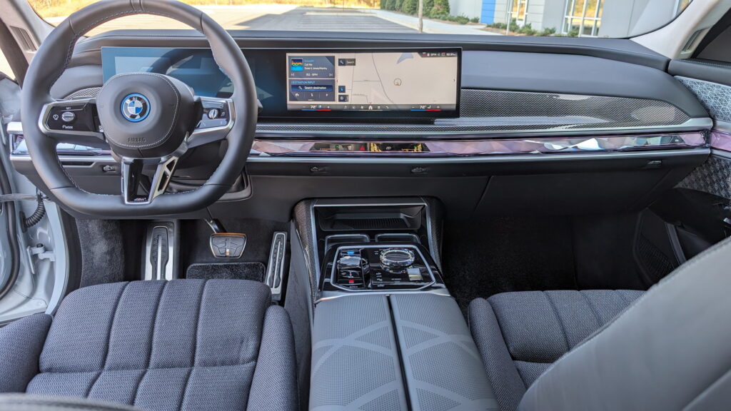
Having tinkered around with a number of BMW infotainment systems lately I was surprised that the entry got a score of 7-0. Still, the criticism is warranted. “I hate the climate controls on the screen, especially to turn off the AC or to adjust the heating seats, where you have to open the climate menu and look for the buttons. It’s not practical and it’s dangerous,” says DMJ.
Notably, this is something we complained about in recent BMW reviews. The general system is fine but baking some climate controls into it feels like a miss. Still, the trackpad feels like a simple workaround.
2 – Kia
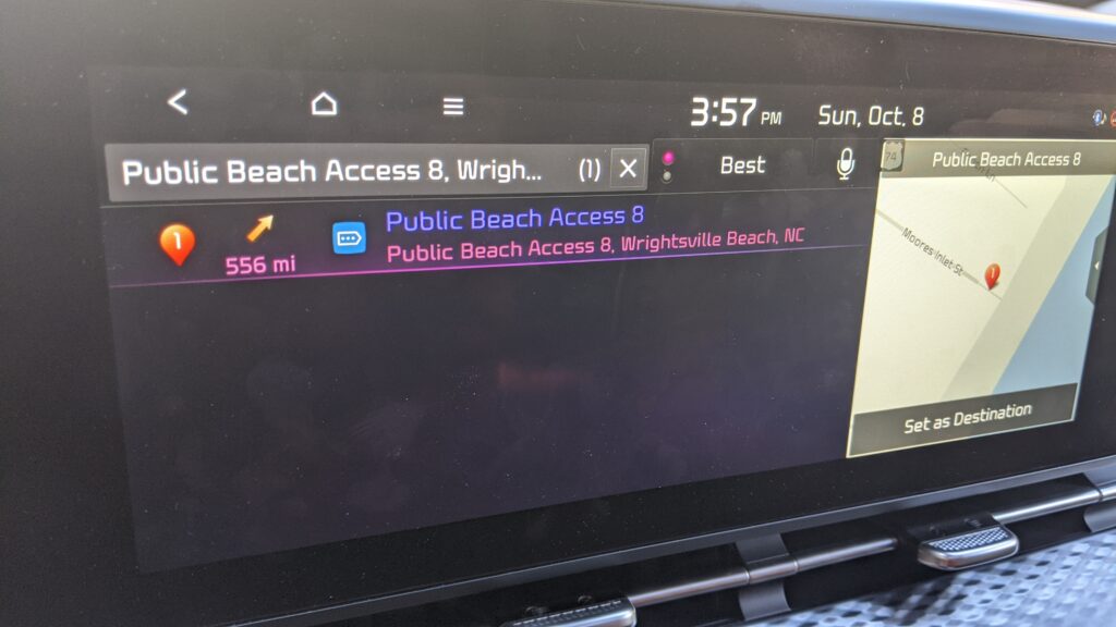
The Retired Viking called out Kia saying that “The radio preselects move and scroll when touched, tone settings are buried three layers deep.” That’s true and speaking from experience, the integrated navigation can be a bit obtuse at times.
1 – Lexus/Acura/Mercedes/Tesla
Boy oh boy was it hard to pick a single terrible infotainment system for the audience. In fact, the top comment mentions no less than three different brands, Lexus, Acura, and Mercedes, so they get billing here. On top of that the first top comment with only a single brand mentioned was Tesla so it’s here too and they all share something in common: a lack of enjoyable interfaces.
Don’t get us wrong, some people will love the way these four brands present infotainment and interaction but on the whole these two comments received a combined score of 24-0. Then, the very next top comment focused specifically on “not having physical AC buttons”. Again, the focus is a poor interface.
Lexus and Acura get called out for their poor trackpad. Mercedes got noticed for its somewhat fumbly capacitive buttons. Tesla gets on the list for lacking Android Auto and Apple CarPlay. Notably, some of these automakers are already working to improve these systems, offering users a better experience.


