- Jaguar has started communicating its new logo and branding for the company’s make-or-break rebirth.
- The automaker’s Chief Creative Officer told journalists he knows not everyone will like Jag’s new direction.
- “[We have] not been sniffing the white stuff – this is real,” Gerry McGovern said.
The definition of madness is trying the same thing over and over and hoping for a different result, according to the old saying. Jaguar’s been there, done that, so now it’s doing something really different. But journalists who attended the reveal of the brand’s new logo and direction think it might be mad anyway.
In case you’re not up to speed with what’s going on at Jag, the company has axed its entire product line and is rebooting itself as an EV-only company that will launch three electric vehicles between 2025 and the end of the decade. We’ll see a concept version of the first of those – a long, low four-door sedan – on December 2.
Upmarket Aspirations
But these three new cars aren’t direct replacements for the axed XF, F-Type, and F-Pace. They’ll be far more luxurious and expensive because Jaguar wants to position itself further upmarket, as a rival to Porsche and Bentley. It really starts with a clean sheet of paper, and it’s not only the vehicles that are new; so is the bizarre branding.
More: Jaguar Starts Over With New Branding, Electric Dreams, And A Big Question Mark
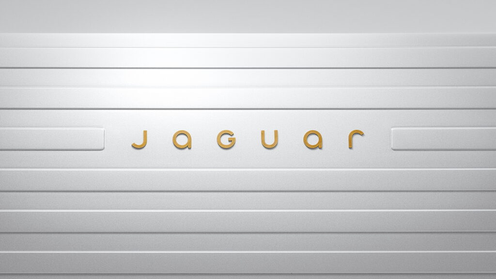
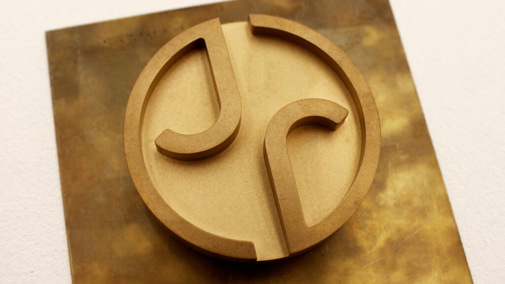
We say bizarre because the automaker’s fresh logo is its name spelled out in widely-spaced type using a mix of upper and lower-case letters. At first glance, it looks like the ‘G’ is the only upper-case letter (G for Gerry McGovern, the brand’s Chief Creative Officer, perhaps?), but Jaguar disabused The Verge of that notion, explaining that the ‘J’ and ‘U’ are also upper-case. Which doesn’t make it any less ridiculous.
Fashion Over fUunction?
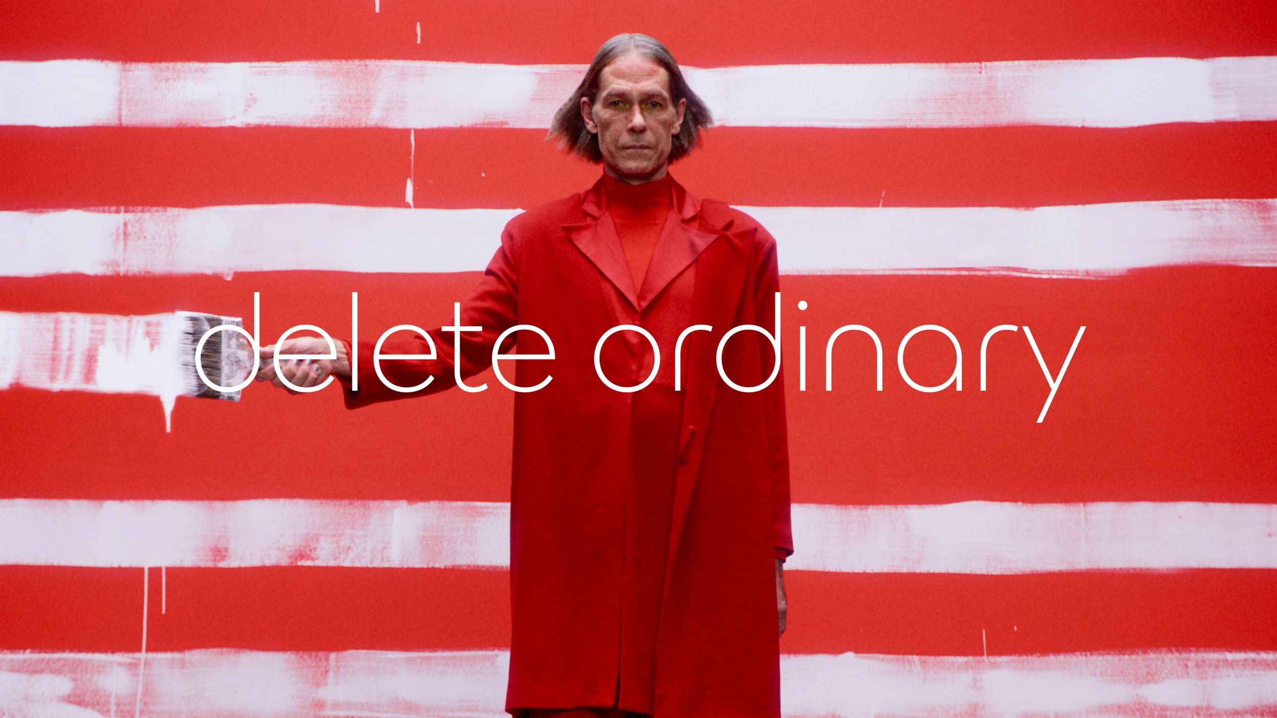
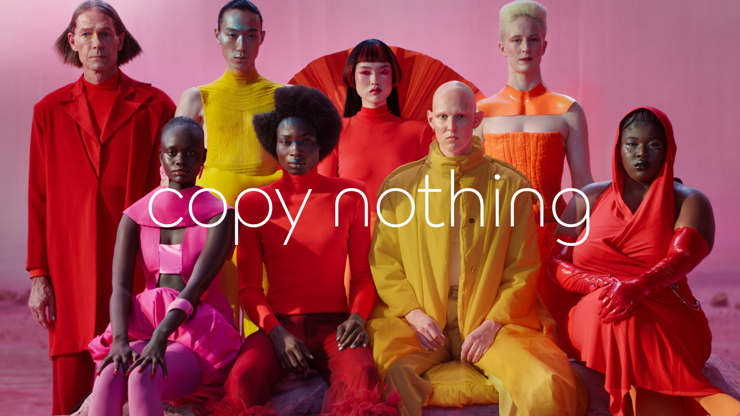
And as if JaGUar wasn’t already inviting enough ridicule with its logo nonsense, it opened the door to more mockery by releasing a video on social media that could pass for a perfume ad. There were plenty of bright colors and clothes that you’d never see outside of Paris Fashion Week, but not a single car.
Car Dealer Magazine’s James Baggott says he was forced to sit through an hour of marketing waffle at “the most bizarre automotive media launch I’ve ever attended” while Jag execs parroted the ‘delete ordinary’ and ‘live vivid’ phrases that a marketing agency probably charged JLR millions to come up with. McGovern told journalists that the rebranding project was deadly serious and that his team had “not been sniffing the white stuff – this is real,” Baggott reports.
A Risky Gamble
The long-time JLR design boss also acknowledged that while the new direction was designed to “stir the emotions”, not everyone will be a fan. Older, traditional Jaguar buyers are likely to be non-plussed by the pomp, and XE and E-Pace owners will find they’re 30 pay rises away from being able to afford next year’s new sedan, which will start at north of $120,000.
And anyone who has been left stranded without use of their car for months due to Jag’s parts disaster won’t give it the time of day, no matter what the new EV looks like (Jaguar says it will still retail and repair older models, but there will be fewer dealers, with those remaining getting a luxury makeover).
Will It Pay Off?
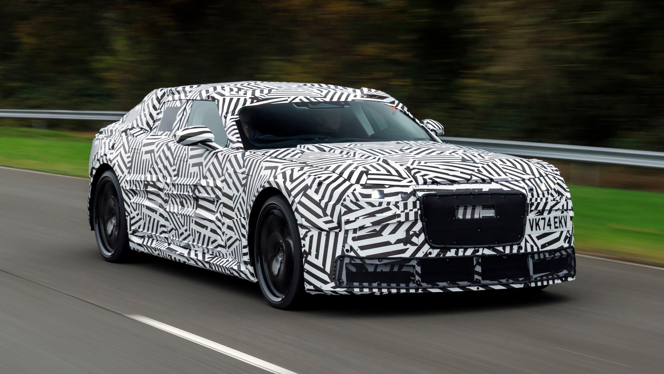
But Jag’s main goal for now is to communicate that huge changes are coming and to get people talking about that. So even if the brand is getting roasted on social media, the campaign is working in one sense. What really matters though, is not the typeface of the new logo, but what the new electric sedan looks like. We’ve already seen official spy shots but we can’t wait to see the concept on December 2.


