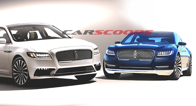
When Lincoln showcased the Continental Study out in the open for the first time, former Bentley designer Luc Donckerwolke harshly criticized it as being a Bentley Flying Spur copy.
So it was back to the drawing board for Ford’s luxury car manufacturer, but against all odds, Lincoln managed to keep close to the concept and actually throw it into production.
Seeing it for the first time, the Continental echoes the concept car that spawned it (even sporting the same wheel design), but it doesn’t look reminiscent of a Bentley anymore. So, what’s the catch? It seems like simple “design trimming” can go a long way.
The front end of the car continues the concept’s main theme, but is less rounded on the production model, which retains the narrow, complex front headlights, and even the interestingly styled grille (albeit pushed more outward) along with the chrome mesh. The 2017 Continental also lost the concept’s more intricate details, air intakes and accessories on the front bumper – with chrome accents – that made it look very elegant and reminiscent of the 1950’s era of motoring. Perhaps the air intakes on the production vehicle’s front bumper with the glossy black sills and daytime running lights – are not quite our cup of tea, but they don’t look obtrusive at all.
Coming on to the profile, the differences between the two are starting to become more obvious, as the concept clearly has a lowered roofline, and an overall elongated shape. Mind you, the Continental study is bedizened in chrome, as the side skirts and rear bumper apron are made (to shine) out of a thick chrome-plated strip that evolved into a thin line on the production variant. Back to the matter of hand, the concept’s lowered roof forced the windows to become more compact and the C-pillar more thick, making the car appear more aggressive – a trait that wasn’t adopted by the road going variant. There are lots of other subtle, concept-like details that didn’t made it into production, including the frameless windows, the slimmer side mirrors, and the artsy door handles.
Speaking of door handles, their positioning remained more or less the same, in a unique place for a production automobile (at the base of the side windows), incorporating a security code on the B-pillar.
At the back, once again, the styling theme is familiar, but the outcome isn’t as eye-catching as on the concept, with the production car having a less aggressive stance. The rear light clusters were also redesigned to fit production legislation, becoming thicker and more noticeable in the process. The quad exhausts were replaced with two rectangle-shape orifices embedded in the rear bumper, while the boot opening is now cutting into the car’s body for a wider, bigger access.
In the interior, the differences between concept car and production car are somewhat noticeable, with the latter retaining the overall design, but losing a lot of details along the way. So, don’t expect to find a sea of chrome-plated elements in the cabin or those neat 1950s-styled air vents, as the normal car still reminds us that not everything can be carried from idea to reality in the same format. The two individual back seats were also scrapped in the favor of a conventional approach, although a console with climate and infotainment control can be used at any time as a separator.
At the end of the day, whether you like Lincoln’s flagship, is definitely a matter of personal taste, but either way, we’d appreciate your comments on both the concept and the production Continental below.


